I’m willing to bet that throughout your schooling, you have had to take at least one rhetoric and composition class. Whether you slept through it like I used to or took detailed notes like my friend (Shout out to Sarah: You saved my GPA a few times, and for that, I am eternally grateful), I guarantee the rhetorical triangle permeated your existence at one point or another. Ethos. Logos. Pathos. Sound familiar? Yes, your teachers were speaking literal Greek to you and expecting you to understand what they meant (But, honestly, what’s new?), which seems like quite the request, but I promise, they aren’t to blame; Aristotle is.
Aristotle had a bright idea, and he called it pisteis, meaning “proof”. Don’t worry; I’m not sure how to pronounce it either, but here we go. Aristotle separated the art of persuasion into two types of “proof”: atechnic (artless) and entechnic (artful). Atechnic proofs are the arguments that are not explicitly used, but everybody knows them prior. For example, I don’t need to make the argument that homophobia is bad because [good] people already know that, and that makes the argument kind of lackluster or...artless. So, the only logical thing to do from there is to make it artful, which is where the entechnic proofs come into play. Entechnic proofs are the things (ethos, logos, and pathos) that the writer provides in order to back-up and enhance the atechnic proof. To demonstrate this point, let me dissect a pre-existing infographic in terms of its ethos, logos, and pathos.
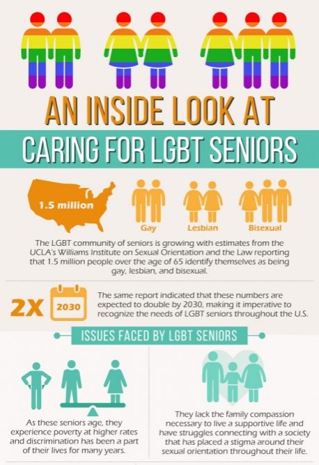
Ethos (“character”) is a way to appeal to readers through establishing credibility and authenticity as the author of a piece. Short of interjecting yourself into the infographic by way of an author bio, creating ethos in an infographic can be kind of difficult, so it’s important to really apply your knowledge of the subject to the infographic. To illustrate this point, I assert that this infographic from www.caringpeopleinc.com misses the mark with its ethos for a number of reasons. The point of this infographic is to create an awareness for LGBT elder care and provide context as to what this marginalized group experiences in particular, but as you can see right away, the graphics are severely lacking in one area and confusing in others. We see graphics representing gay couples and lesbian couples with relative ease, but then we stumble upon a poorly chosen graphic that is supposed to elicit an “Oh, that means bisexual!” response; however, to a person who is both a part of and knowledgeable about this community, this graphic really gives more of an “Oh, that’s a polyamorous relationship! Cool!” vibe. But, at least they covered the whole LGBT spectrum by filling the objects with rainbow stripes, right? Well, not quite.
As I’m sure you can see, there are only three graphics to represent four letters, which doesn’t quite add up. Unfortunately, this infographic seems to think the T is silent, and this fact does nothing to support its ethos either. There is no graphic to represent the transgender community, and aside from the catch-all rainbow filter used in exactly one place in this design, there are no further allusions to the transgender community. Caring People makes references to neither binary trans individuals nor non-binary individuals nor genderqueer individuals; they do not discuss any of the various gender identities that exist, referring only to those that “identify themselves as being gay, lesbian, and bisexual,” which just so happens to be grammatically incorrect to add major insult to silent injury. If we look more closely at the verbal element of this infographic, we notice that they use “sexual orientation” as a catch-all term for the LGBT community (even though the T represents a gender identity, not a particular sexual orientation) and phrases like, “a community that fully supports their lifestyle” and “acceptance of their life choices.” Naturally, this leads the reader to deduce an underlying “The homosexual lifestyle is a choice, but we fully support all sexual orientations, even being transgender!” kind of ignorance, which significantly takes away from the ethos of the infographic.
One additional way in which this infographic falls short of having good ethos is in terms of its color scheme. A color scheme can convey a lot because it can sometimes show a sense of being “in tune” with the subject by way of the colors’ symbolic meanings. (To see a good example of how colors can make a difference in terms of an infographic’s ethos, click here.) While the Caring People infographic does use the trademark rainbow to try and symbolize an overarching sense of acceptance, they do not use any additional colors to their advantage. They settle on a turquoise/orange combo, which splashes of red and blue in a few places (C-C-Combo breakers!), in order to match their corporation’s pre-existing aesthetic. They could (and should) have continued using the rainbow theme throughout the design while also using their company’s colors in place of the normal, vibrant orange and blue in the rainbow. This lack of attention to detail not only creates a weak color scheme for the design as whole, but it certainly takes away from the other, stronger points of the infographic, like its logos and pathos.
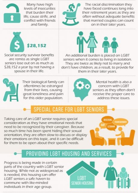
The Caring People infographic is unsurprisingly strong in terms of its logos (“reason”), which is a way to appeal to readers through facts and knowledge, and fairly strong in terms of its pathos (“emotion”), which is a way to appeal to readers through emotions and emotional responses. An infographic about LGBT elder care is expected to rely heavily on research and statistics, and the sources they cite (mostly the .orgs) are rooted in extensive knowledge and credibility. Through some of these facts, they provide great examples of pathos. For example, they state, “Many have high levels of insecurities that burden their life, cause strife, and conflict with friends and family,” and “Their biological family can oftentimes be estranged from their lives, causing great loneliness and pain for this older population.” Both of these statements are facts that just so happen to be supported by the credible sources and fueled by the emotions they incite in the readers. While not every bit of knowledge can add to the pathos of a particular piece of work, using the more emotional facts to your advantage when composing an infographic meant to both inform and persuade is the best way to go about it. But, sometimes, that’s just not enough.
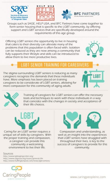
Each side of the rhetorical triangle plays an integral part in the creation of a successful rhetorical composition, and if one component is lacking, the finished product will suffer. As noted throughout this blog post, the Caring People infographic does a great job of showing off their logos, a mediocre job of showing off their pathos, and a pitiful job of showing off their ethos, which really leaves something to be desired in their overall composition (both visual and verbal design). Additional issues I have with their design include: lack of negative/white space, odd clip art choices, lengthy blocks of text, and overall font choice. This infographic is cluttered, cheesy, and cheap because as much as this corporation is trying to show that they care, their use of the rhetorical triangle (specifically their ethos) proves otherwise.
0 Comments
Leave a Reply. |
TheLiteralRandi
© 2021 Randi Flick
